BTQ Lab
everyday clinical resilience
BTQ LAB IS A DERMA SKINCARE BRAND THAT 'PROVES' DEFINITIVE, VISIBLE SKIN CHANGES THROUGH RIGOROUS DATA AND TESTING, RATHER THAN VAGUE PROMISES OR EMOTIONAL CONSOLATION.
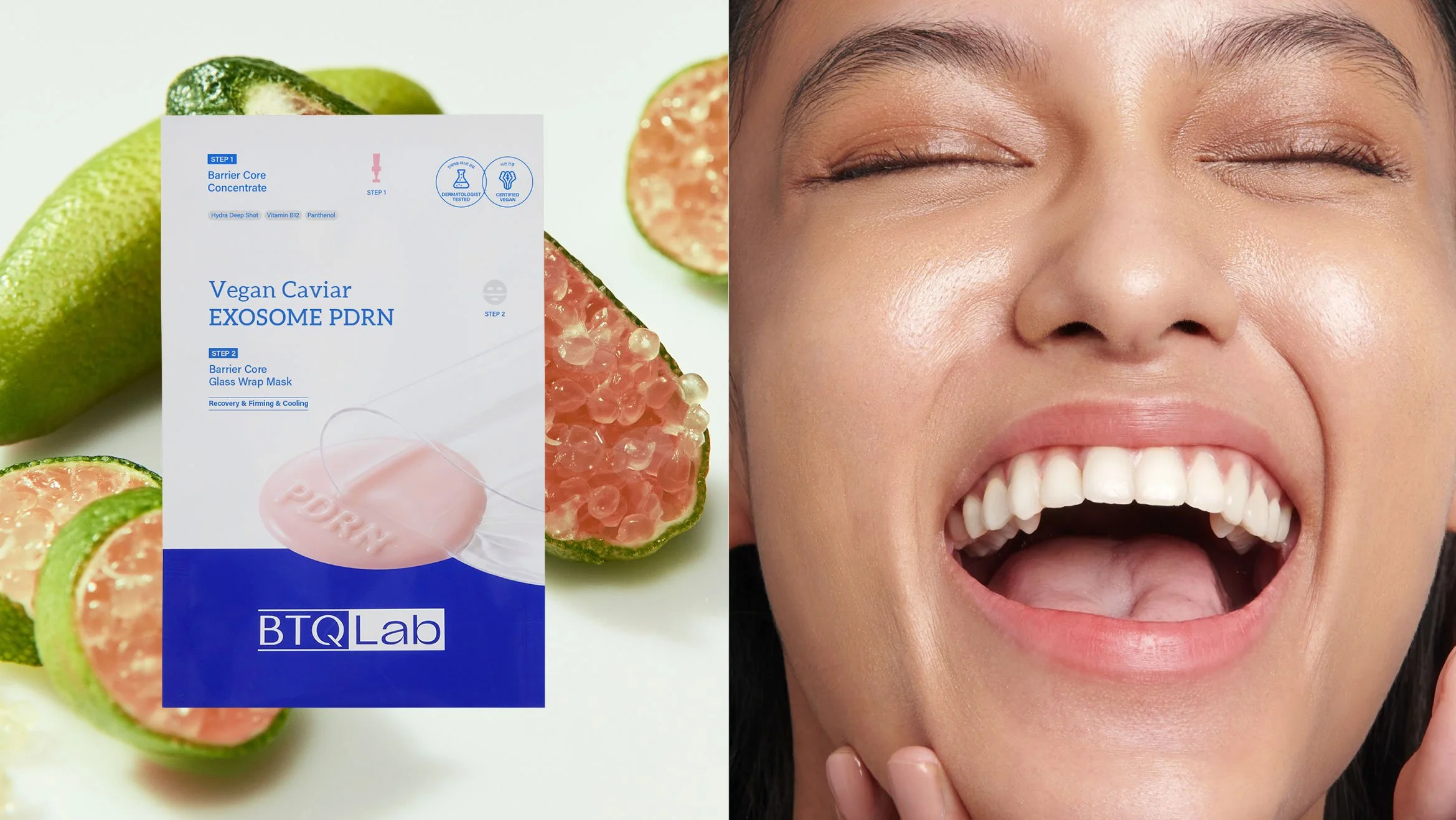
TO VISUALIZE THE BRAND'S CORE PHILOSOPHY OF 'A SOLUTION LAB ON YOUR DRESSING TABLE FOR ALL DIFFERENT SKIN TYPES,' WE ELIMINATED EXAGGERATED DECORATIONS AND ESTABLISHED A COMPREHENSIVE BRAND IDENTITY AND PACKAGE DESIGN SYSTEM HIGHLIGHTED BY SCIENTIFIC TRUST AND CLINICAL EXPERTISE.
비티큐랩은 막연한 약속이나 감성적인 위로 대신, 철저한 데이터와 시험을 통해 눈에 보이는 확실한 피부 변화를 ‘증명’하는 더마 스킨케어 브랜드입니다. 우리는 '모두 다른 피부를 위한 화장대 위 솔루션 연구소'라는 브랜드의 핵심 철학을 시각화하기 위해, 과장된 장식을 배제하고 과학적인 신뢰감과 임상적 전문성이 돋보이는 전반적인 브랜드 아이덴티티 및 패키지 디자인 시스템을 구축했습니다.
under the concept of 'a solution lab on your dressing table,' the design focus was strictly aligned with 'scientific proof' and 'data.' to allow consumers to experience professional clinical architecture in their daily lives without downtime, we adopted a rational and intuitive lab motif instead of unnecessary metaphors. through this, we firmly established its identity as a reliable derma care brand, turning consumers' moments of hesitation into 'the confidence of direct verification.'
'화장대 위의 솔루션 연구소'라는 컨셉 아래, 디자인의 포커스를 철저히 '과학적 증명'과 '데이터'에 맞췄습니다. 클리닉의 전문적인 설계를 다운타임 없이 일상에서도 경험할 수 있도록, 불필요한 은유 대신 이성적이고 직관적인 랩(Lab) 모티프를 차용했습니다. 이를 통해 소비자가 망설였던 순간을 ‘직접 확인하는 확신’으로 바꿀 수 있도록, 신뢰할 수 있는 더마 케어 브랜드로서의 확고한 정체성을 확립했습니다.
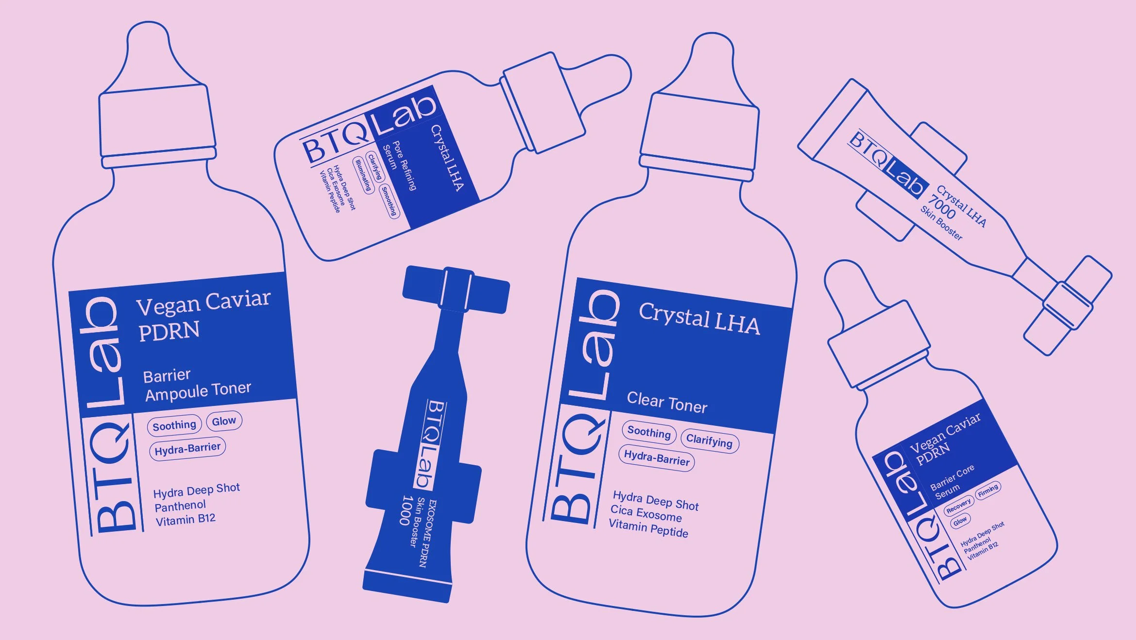
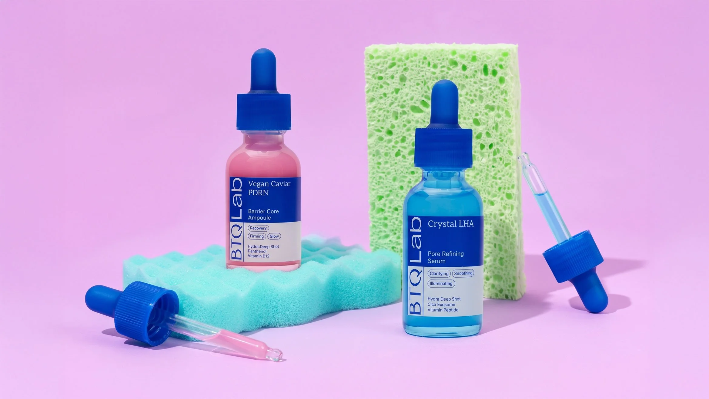
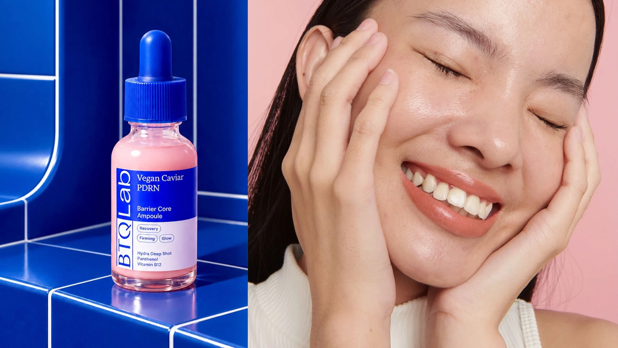
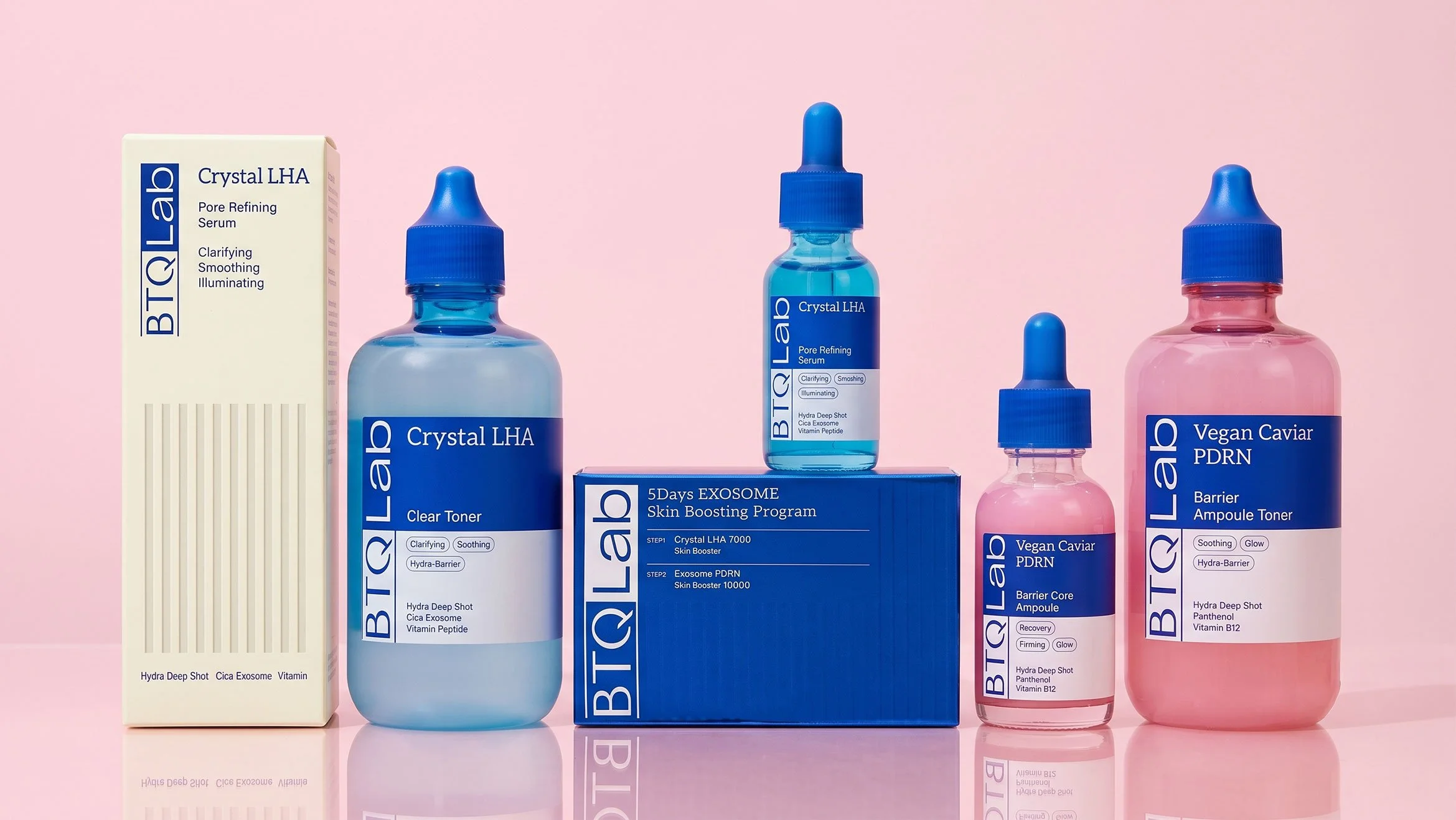
btq lab's design is structured with a typography-driven information hierarchy to evoke a dermatology research lab. in particular, by boldly placing the logotype vertically on the front-left and aligning the text within a clear grid, we established visual rules akin to reading a lab index or prescription. the containers utilize a transparent base—allowing professional efficacy to intuitively stand out—combined with trust-inducing cobalt blue caps and packaging across the line. this completes a refined lab cosmetic design that transparently conveys pride and technological prowess in its ingredients.
비티큐랩의 디자인은 피부 과학 연구소를 연상시키도록 타이포그래피 중심의 정보 구조로 설계되었습니다. 특히 전면 좌측에 로고타입을 세로로 볼드하게 배치하고 텍스트를 명확한 그리드 안에 정렬하여, 실험실의 인덱스나 처방전을 읽는 듯한 시각적 규칙을 부여했습니다. 용기는 전문적인 효능이 직관적으로 돋보이도록 투명 베이스에 신뢰감을 주는 코발트블루 캡과 패키지를 공통으로 적용하여 성분에 대한 자부심과 기술력을 투명하게 전달하는 정제된 랩 코스메틱 디자인이 완성되었습니다.