DELERE
caviar glow
Delere is a timeless skincare brand that captures the power of caviar, the ingredient closest to human skin among all the ingredients on Earth. Just as a black hole absorbs and erases time, its concentrated ingredients are completely absorbed, completely eradicating skin concerns and even absorbing time itself, revealing an unknown beauty.
델레어는 지구상에 존재하는 모든 성분 중 사람의 피부와 가장 가까운 캐비아의 힘을 담아낸 타임리스 스킨케어 브랜드입니다. 블랙홀이 시간을 흡수해 삭제하듯, 농축된 성분은 완전한 흡수를, 피부 고민은 완전히 삭제하고 시간마저 흡수하는 미지의 아름다움을 발견합니다.
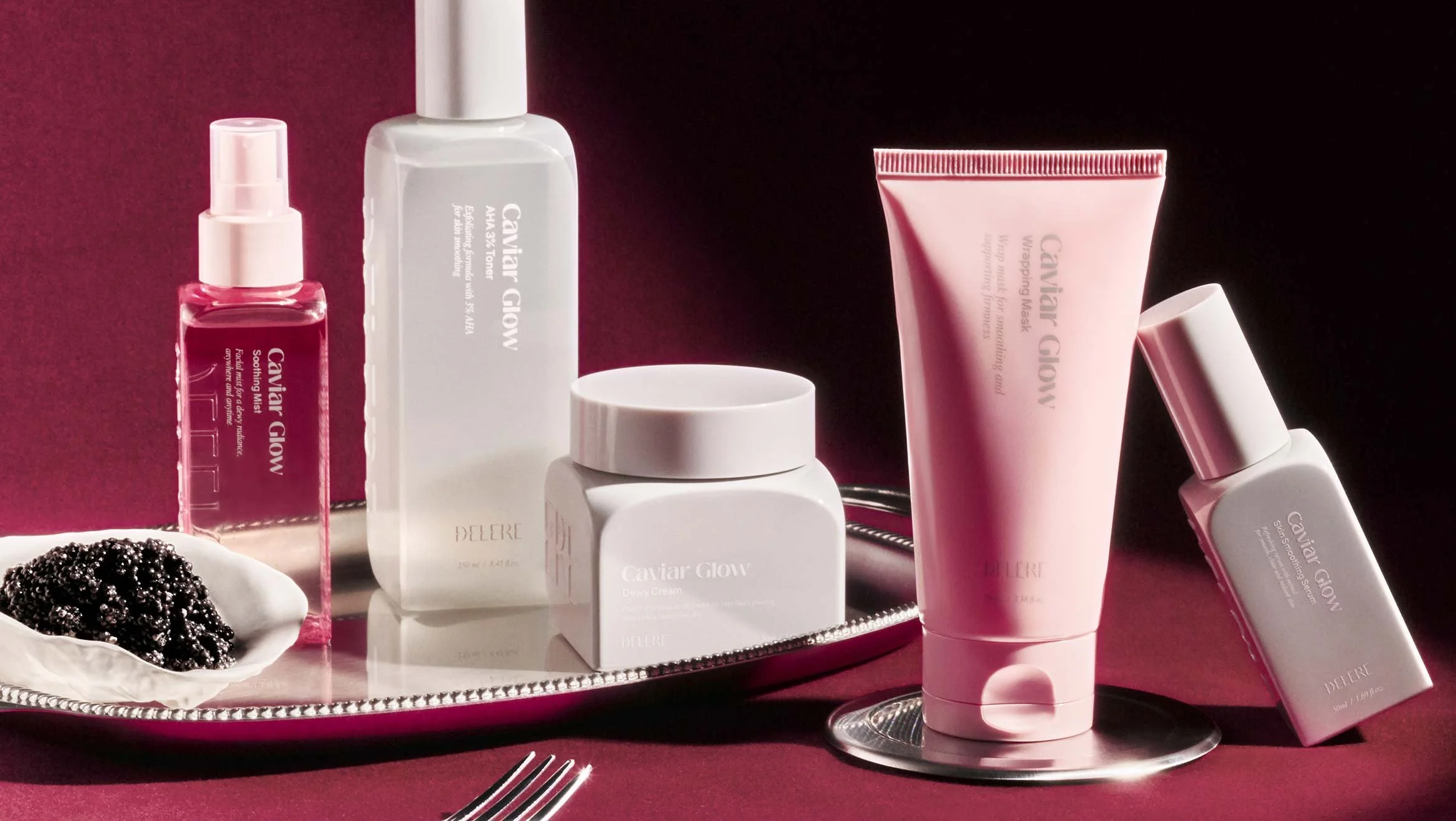
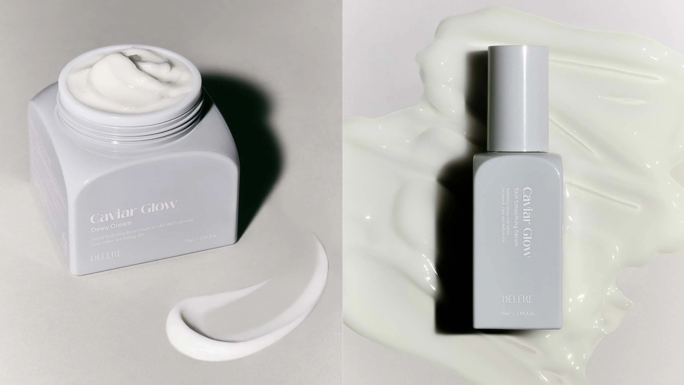
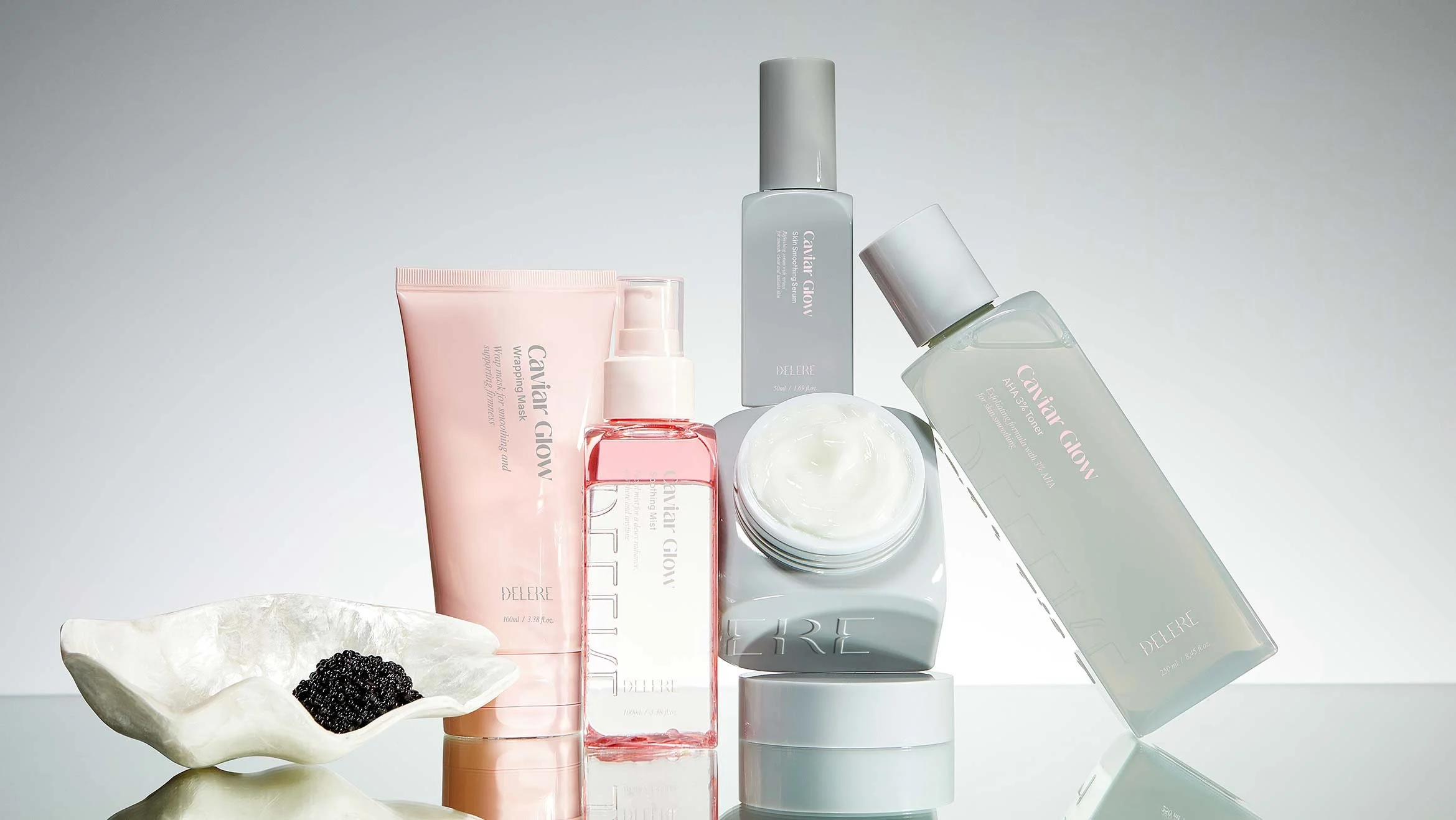
THROUGH THIS DESIGN RENEWAL, WE SOUGHT TO BREAK AWAY FROM OUR AGING IMAGE AND REINTERPRET OUR BRANDING CORE TO STRENGTHEN OUR GROUP POWER AND IDENTITY. IN ADDITION, THE COLOR LINE WAS DIFFERENTIATED FROM OTHER LINEUPS, AND THE FUNCTIONALITY OF THE PRODUCT WAS EMPHASIZED WITH SIMPLE YET REFINED GRAPHICS. CONSIDERING THE TARGET AND CHANNEL, WE ESTABLISHED A NEW IDENTITY WITH A NEW COLOR THAT CAN BE RECOGNIZED AS A SIGNATURE COLOR THROUGH STRONG CONTRAST AND ATTEMPTED TO MAINTAIN delere'S ASSETS BY UPGRADING THE GRAPHIC ELEMENTS OF EXISTING PRODUCTS.
이번 디자인 리뉴얼을 통해서 노후화된 이미지를 탈피하고, 브랜딩 코어를 재해석하여 군집력 및 아이덴티티를 강화하고자 하였습니다. 또한 타 라인업과 컬러를 구분하여 라인을 적용하고, 심플하면서도 정제된 그래픽으로 제품의 기능성을 강조하였습니다. 타겟과 채널을 고려하여 강한 대비감을 통해 시그니처 컬러로 인지할수있는 새로운 컬러로 새로운 아이덴티티를 정립하고 기존 제품의 그래픽요소를 업그레이드하여 브랜드의 자산을 유지하고자 하였습니다.
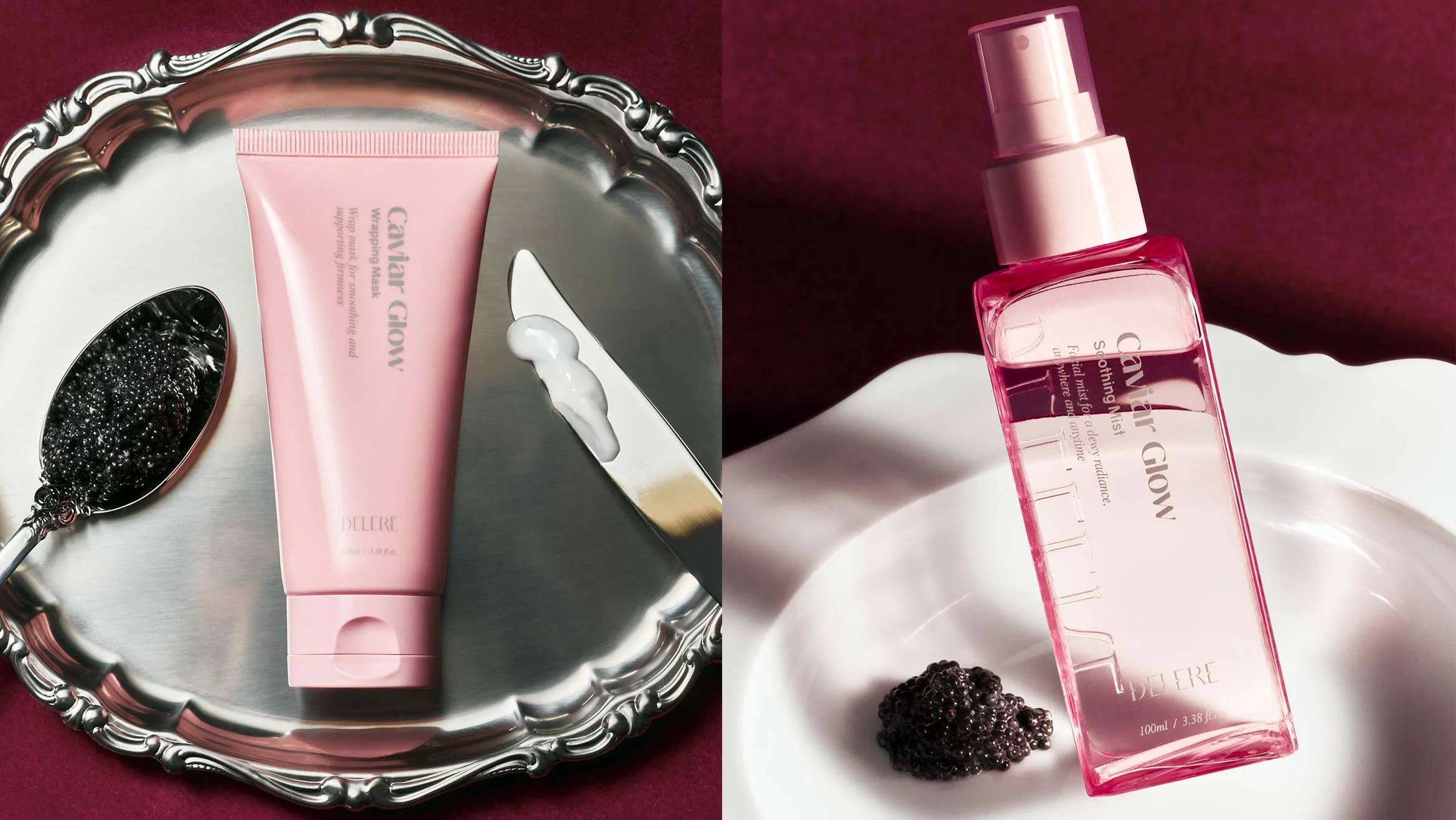
We also developed a signature brand shape and prominently displayed the brand logo to increase visual attention. This resulted in a grid-based graphic system that delivers a compelling first impression and a sense of community in a competitive shelf environment and distribution channels while maintaining mass appeal.
또한 브랜드만의 시그니처 형태를 개발하였고 브랜드 로고를 크게 노출시켜 시각적 주목도를 상승시켰습니다. 이를 통해 대중성을 가지면서도 경쟁적인 매대환경과 유통채널에서 강렬한 첫인상과 군집성을 보여줄 수 있는 그리드 기반의 그래픽 시스템을 개발하였습니다.

Client
cavist
delere
Project Team
Brand Strategy :
dfuze design
Brand Design Identity :
dfuze design
Displine
Brand Identity
Design Application
industrial
Year
2025