Nature Republic
california aloe sun
Nature Republic's California Aloe Sun line is a national product that has been consistently loved since its launch. Through this renewal, we aimed to improve the product attractiveness of the California Aloe Sun product line and solidify its presence by communicating the product identity more clearly and strongly to customers.
네이처리퍼블릭의 캘리포니아 알로에 선 라인은 출시 이후 꾸준히 사랑 받아 온 국민 제품입니다. 이번 리뉴얼을 통해 캘리포니아 알로에 선 제품군의 상품매력도를 향상시키고, 제품 아이덴티티를 고객에게 보다 명확하고 강인하게 발신하여 존재감을 공고히 하고자 했습니다.
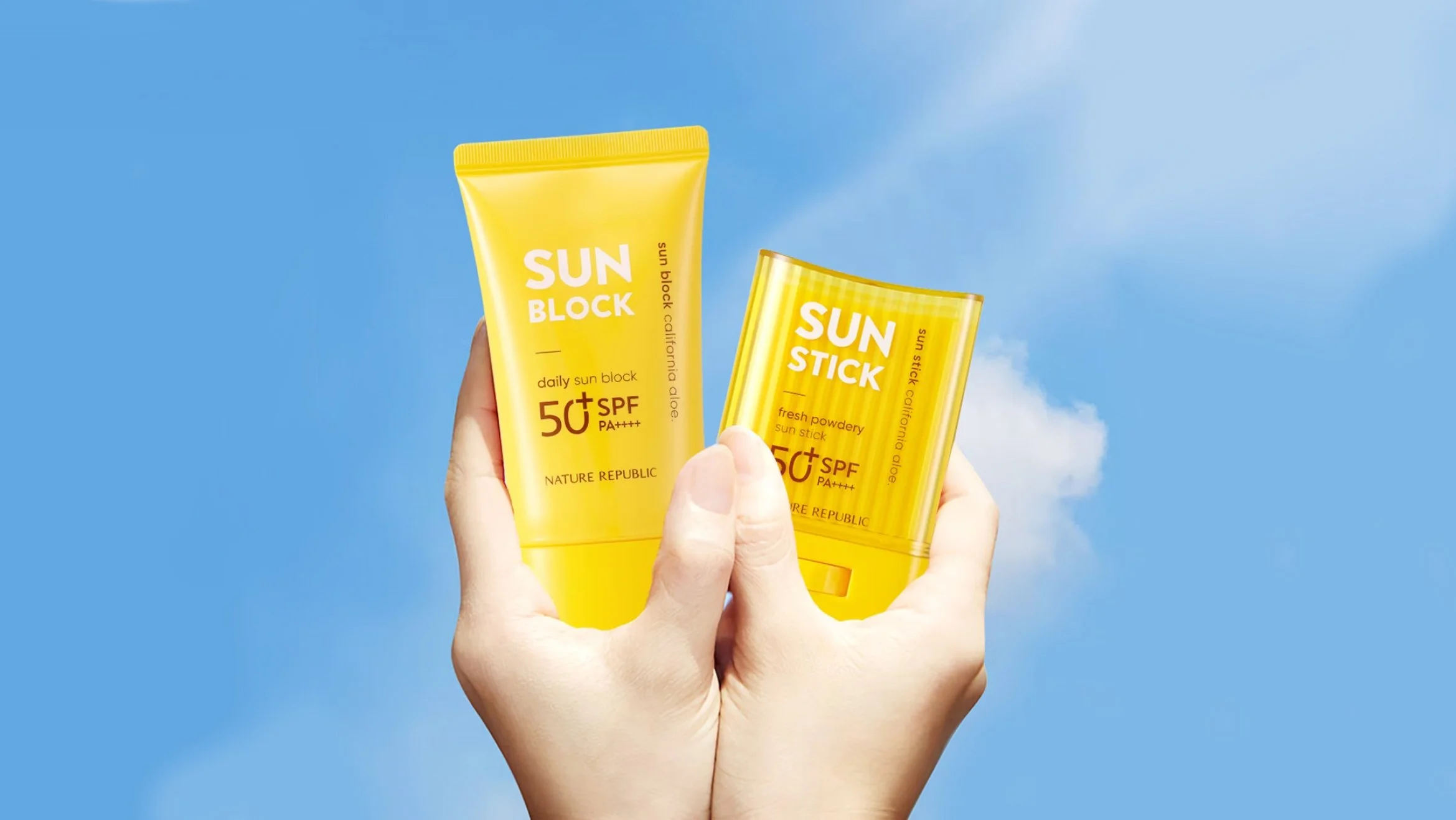
A lot of thought and various attempts were made by adjusting the level of change in shape, color, and graphics to find a new look that well captures the identity of the California Aloe Sun line so that it can establish itself as a representative product that can be used all year round. The main graphic, ‘California aloe’, has been emphasizing its presence by becoming increasingly bold in the initial release version, considering its attention in the retail environment. The sense of contrast that comes from the difference in size of ‘California Aloe’ has secured attention in the offline environment and assigned an order of importance to the large amount of information on the front of the container.
사계절 내내 사용할 수 있는 대표 제품으로 자리 매김할 수 있도록 캘리포니아 알로에 선 라인의 정체성을 잘 담아내는 새로운 룩을 찾기까지 형상과 컬러, 그래픽의 변화 수위를 조절해가며 많은 고민과 다양한 시도가 있었습니다. 메인 그래픽인 ‘California aloe’는 매대 환경에서의 주목도를 고려하여 초기 출시 버전에서 점점 볼드해지면서 그 존재감을 강조해왔었습니다. ‘California Aloe’의 크기 차이에서 오는 대비감은 오프라인 환경 주목도를 확보하고, 용기 전면의 많은 정보에 중요도 순서를 부여해왔습니다.
However, considering that most customers recognize it as a 'Sun' product rather than 'California Aloe' and that this method is not effective for sending as a thumbnail image in the e-commerce market where visibility in online stores is important, a major change was made to the main graphic. I gave it. Going back to the starting point, we started with the Gothic font base, which was the first step of the entire brand renewal, and adjusted the graphics by considering the thickness to ensure visibility in all sales environments. Along with the font change, we reduced the proportion of ‘California aloe’ and raised the level of ‘Sun’ to convey the product’s identity in a unified way. We applied FSC certified paper and soy ink to the single box to create an eco-friendly and sustainable design.
하지만 고객들 대부분 ‘캘리포니아 알로에’가 아닌 ‘선’ 제품으로 인지하고 있는 점, 해당 방식이 온라인 매대 내 가시성이 중요한 이커머스 시장에서 썸네일 이미지로 발신하기에 효과적이지 않은 점을 고려하여 메인 그래픽에 큰 변화를 주었습니다. 다시 출발점으로 돌아가 전체 브랜드 리뉴얼의 첫 시작이었던 Gothic 서체 베이스에서 시작하되, 모든 판매환경에서 가시성을 가질 수 있도록 굵기를 고민하여 그래픽을 조율했습니다. 서체 변화와 함께 ‘California aloe’의 비중을 축소하고 ‘Sun’의 레벨을 끌어올려 제품의 아이덴티티를 통일성있게 발신하였습니다. 단상자에는 FSC 인증지류와 소이잉크를 적용하여 친환경적이며 지속가능한 디자인을 위해 노력하였습니다.