mentholatum
Pain relief
A function completed through understanding and empathy in our lives. Changes in our lives based on the life cycle. That is the value that Mentholatum pursues.
우리 삶의 이해와 공감을 통해 완성된 기능. 라이프 사이클을 바탕으로 한 우리 삶의 변화. 그것이 바로 멘소래담이 추구하는 가치입니다.
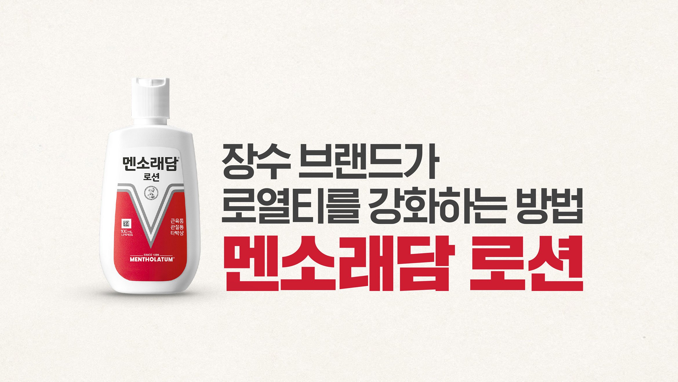
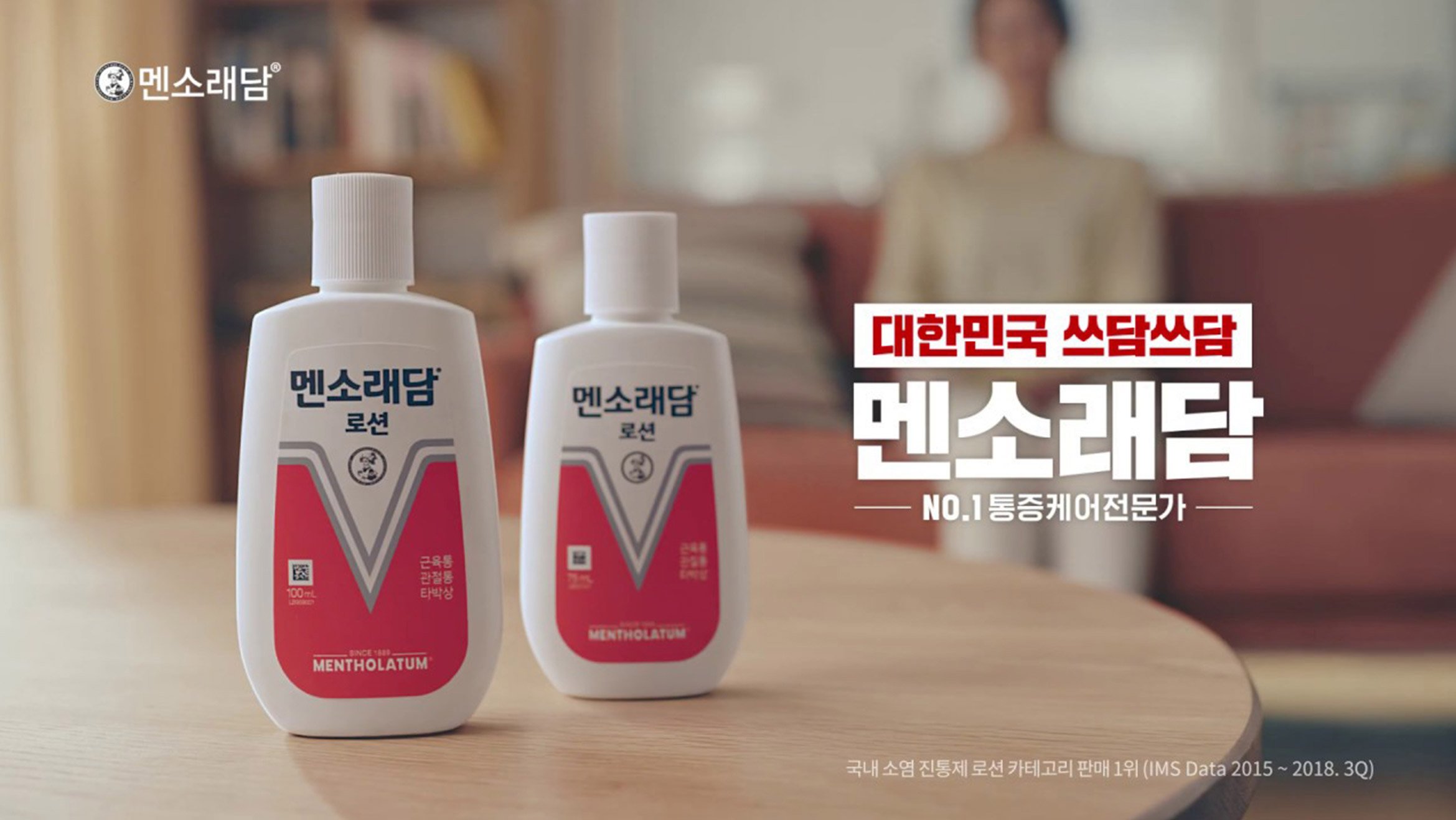
Mentholatum Lotion, Mentholatum's best-selling product, has been released in a new look with more cheerful colors. The harmony of form and detail, made simple by subtracting elements rather than adding them, shows the aesthetics of simplicity and the value that Mentholatum wants to show.
멘소래담의 베스트셀러 제품인 멘소래담 로션은 경쾌해진 컬러와 함께 새로운 모습으로 출시되었습니다. 요소를 더하기보다 덜어내는 작업을 거쳐 간결해진 형태와 디테일의 조화는 단순함의 미학과 맨소래담이 보여주고자 하는 가치를 보여줍니다.
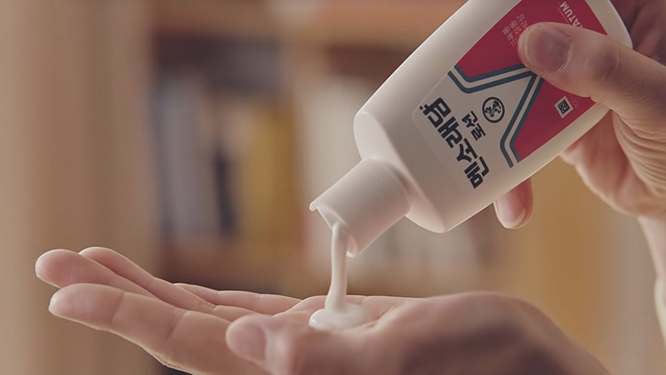
The graphic design, which stands out for its elaborate proportions and balance, is combined with edgy cutting points to create an urban and strong silhouette, expressing the symbolic image of a consistent pain care specialty brand.
정교한 비례와 균형이 돋보이는 그래픽 디자인은 엣지있는 커팅 포인트와 더해져 도시적이고 강렬한 실루엣을 만들어내며, 일관된 Pain Care 전문 브랜드의 상징적 이미지를 표현하고 있습니다.


Client
Mentholatum
Project Team
Brand Strategy :
dfuze design
Brand Design Identity :
dfuze design
Displine
Brand Identity
Design Application
Year
2018-2019